This exhibition was scheduled for the month of September, 2020, at the Vista Grande Public Library in Santa Fe, NM. Because of the restrictions of the COVID19 pandemic, the library has been opened on a limited basis and, as of this writing, is likely to continue in that mode for the foreseeable future. The show that would have been hung will be presented in virtual form on the library’s website. I am presenting it here as well, divided into two slideshows: squares and blurs. Note you can stop the autoplay by clicking on the button in the upper right corner of each image. Please see the previous post for an introduction to the exhibition.
digital darkroom


Squares and Blurs: Introduction
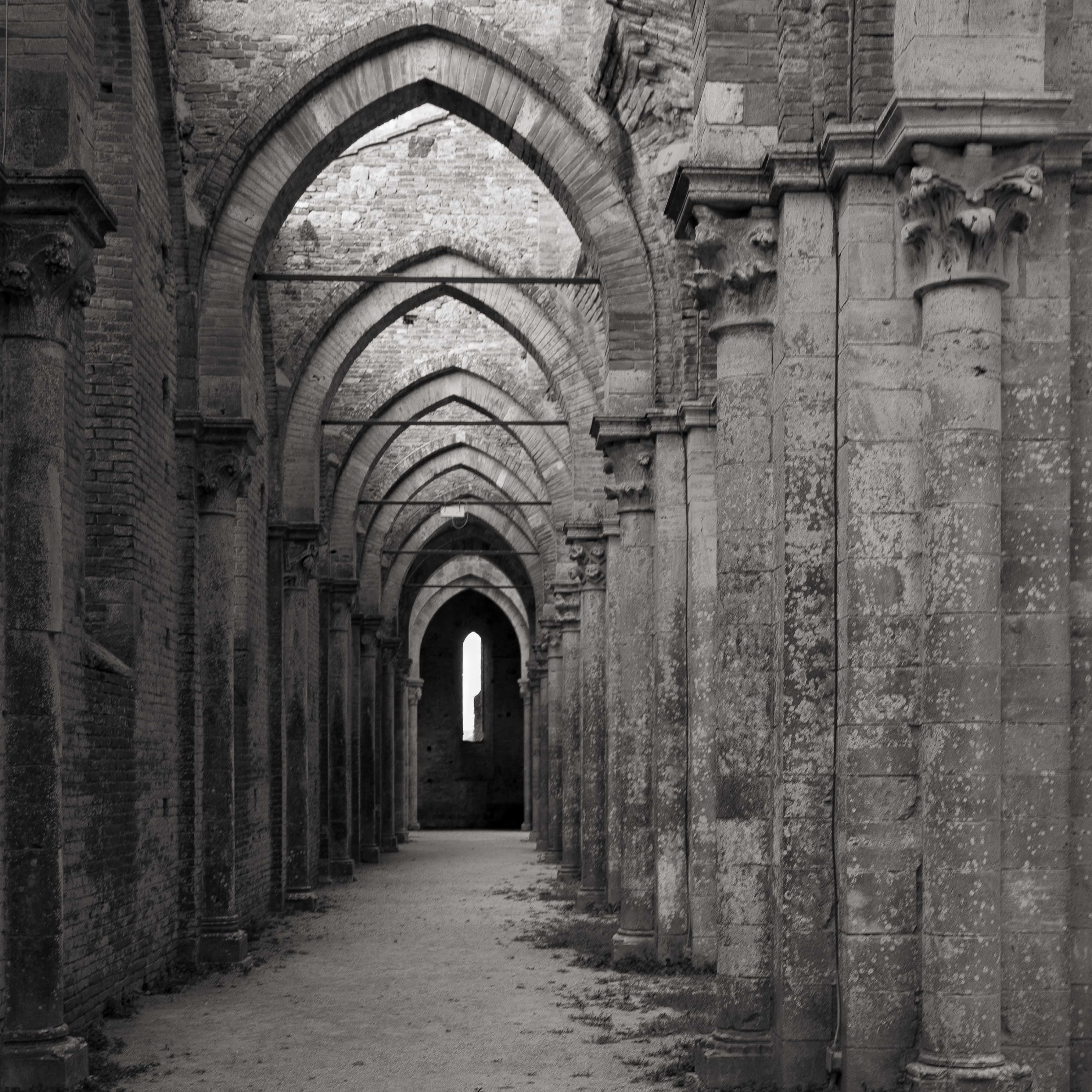
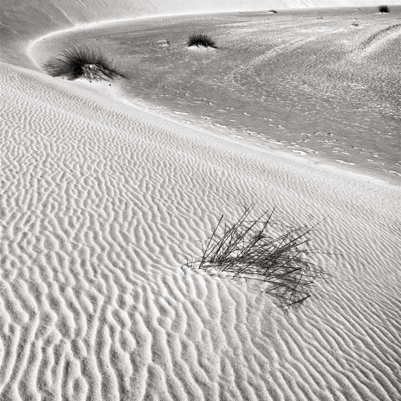
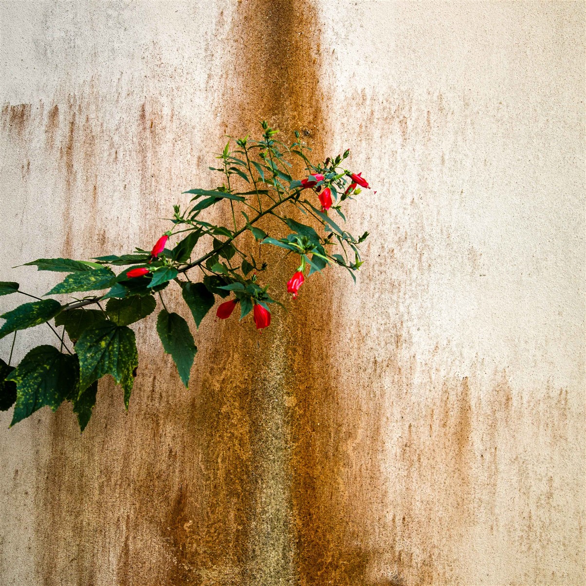
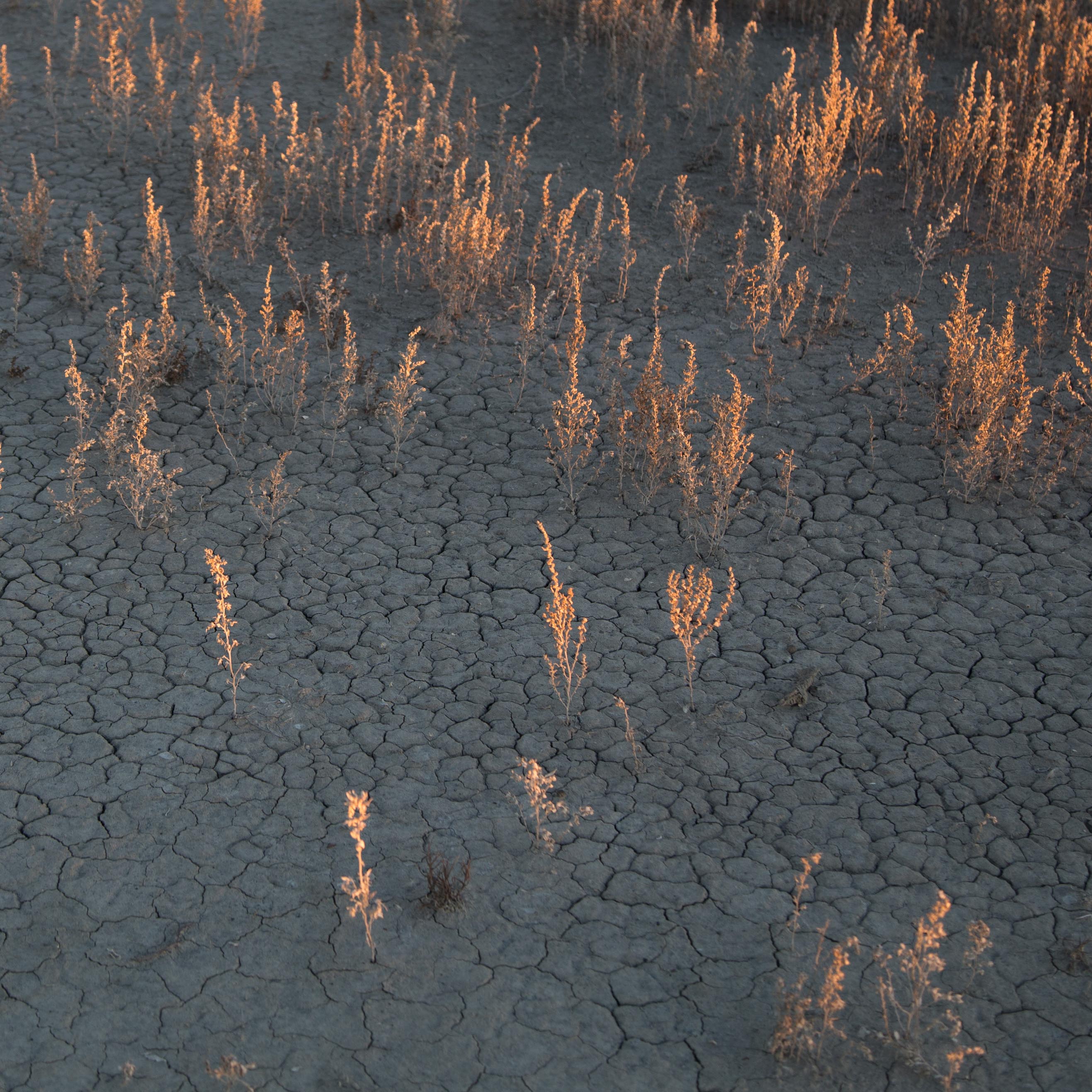
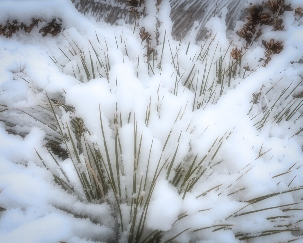
Squares
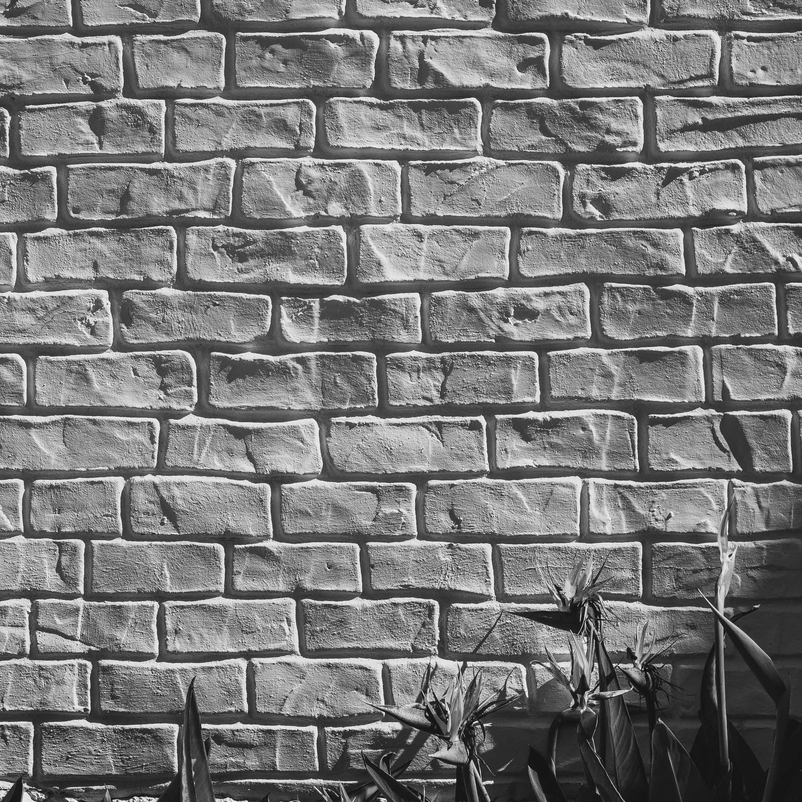
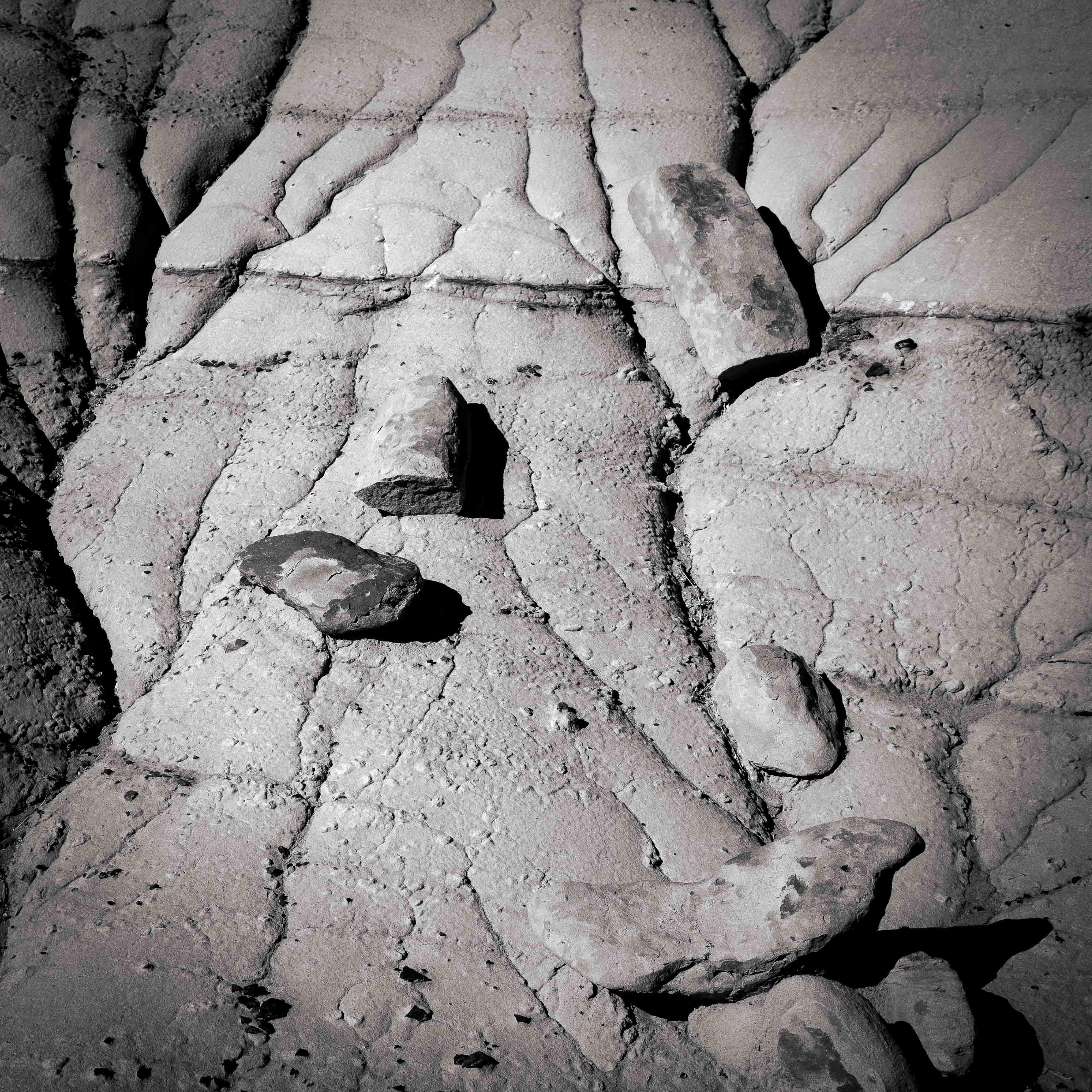
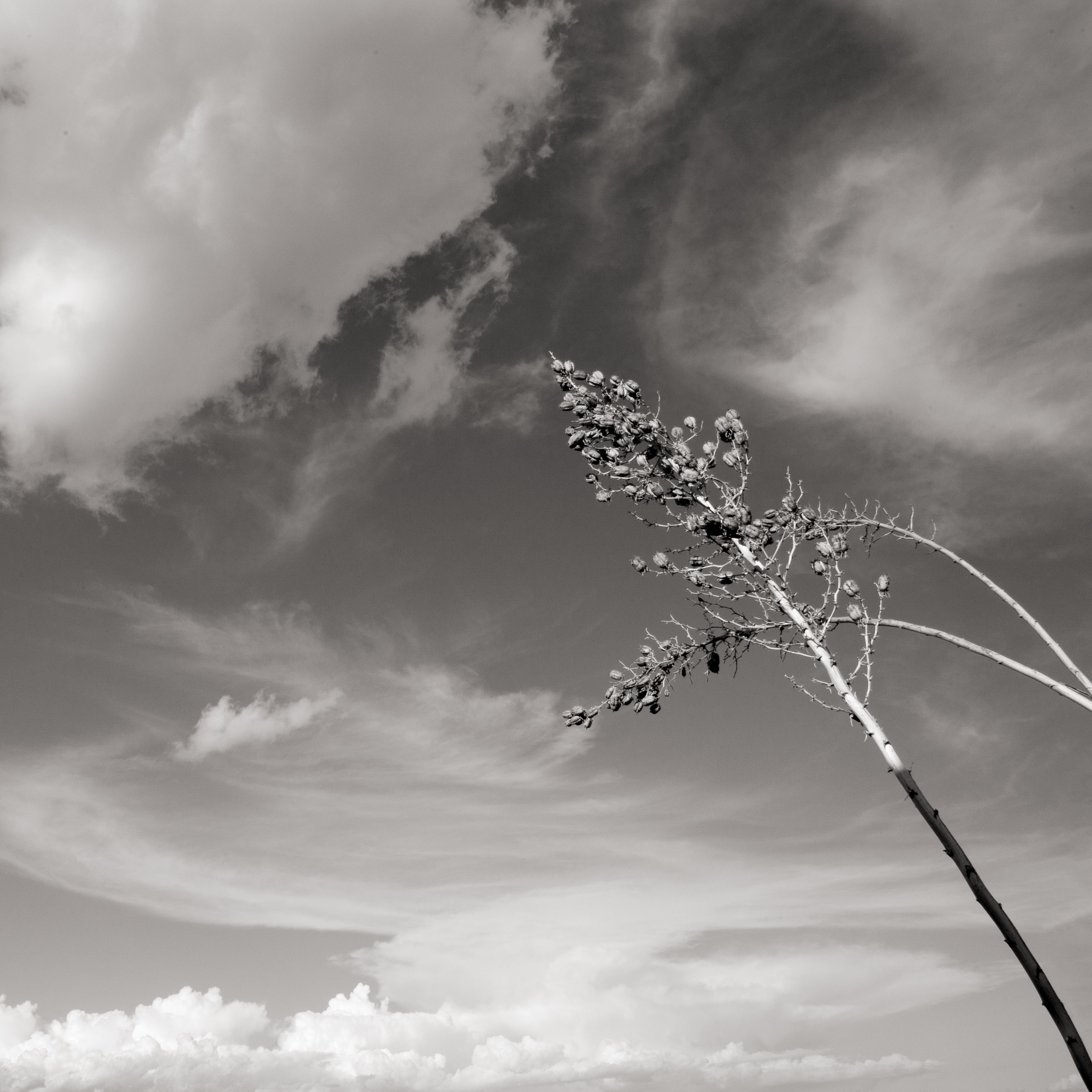
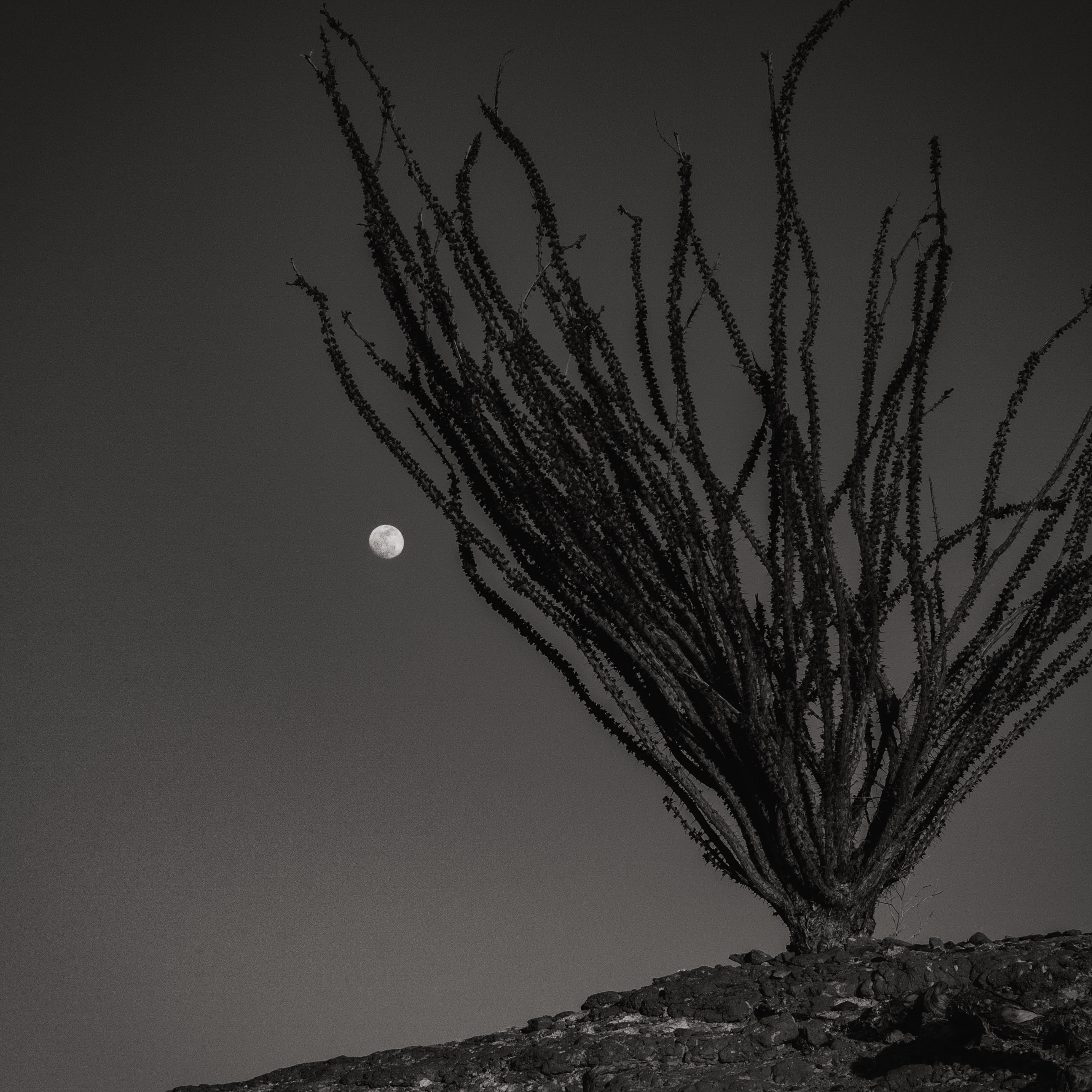
A few years ago I saw an exhibition of small, square format black and white images of Michael Kenna. They were powerful in their elegance and simplicity; I was surprised such small landscapes “worked.” I determined to try my hand at square format. I found myself looking at images with an entirely different eye, finding my impression of the landscape rather than the landscape itself and directing viewers to that intent.
The challenge is to simplify the composition, to distill the essence that makes the scene special. It is a very satisfying exercise and one that is by no means finished as I continue to search for the right balance between shape and texture, the optimum placement of elements within the square and the effective use of negative space. An example may help illustrate these ideas.

This is the original lake trees image. The final image follows.
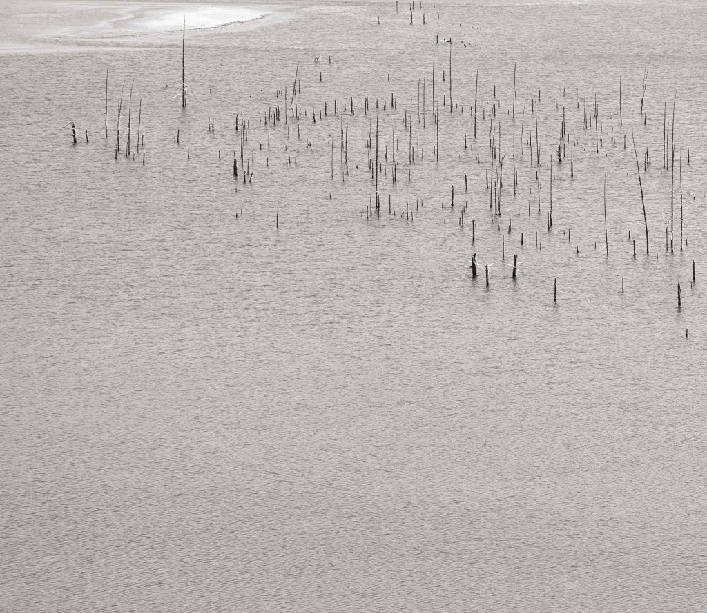
Lake Trees
Here I wanted to reduce the image to what essentially attracted me: those dead trees trunks sticking up from the water. Converting to black and white emphasizes form and texture without the distraction of color.
In the slideshow which is the next post, the black and white square format images are my earliest; the color images more recent.
Blurs
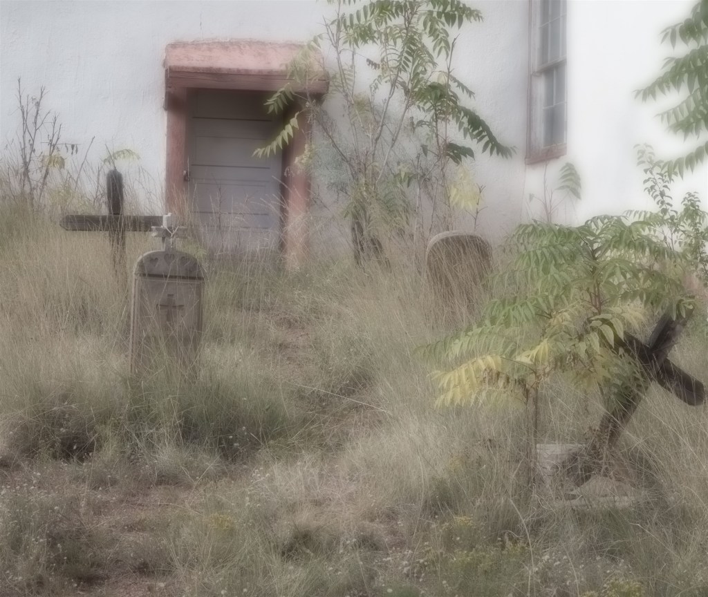
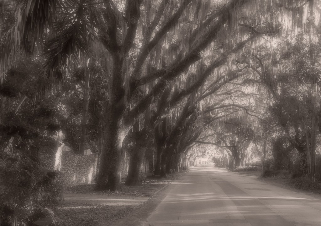
I use “blurs” to summarize a variety of manipulations that can be used to render a straightforward photograph more aesthetically pleasing, more faithful, perhaps, to an original impression, evoking an ethereal or mysterious atmosphere. The intent might be to create a gentler feel or emphasize a more graphic or abstract quality.
Photographers have been doing this from the inception of the medium, sometimes because they had no choice, then purposefully by the Pictorialist School in the late 19th and early 20th centuries to emulate the look of “art.” More often it is done to follow the urges of a personal aesthetic sense. Here is an example.
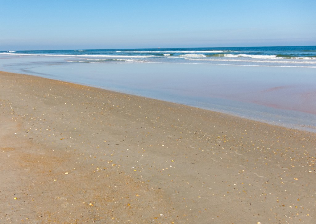
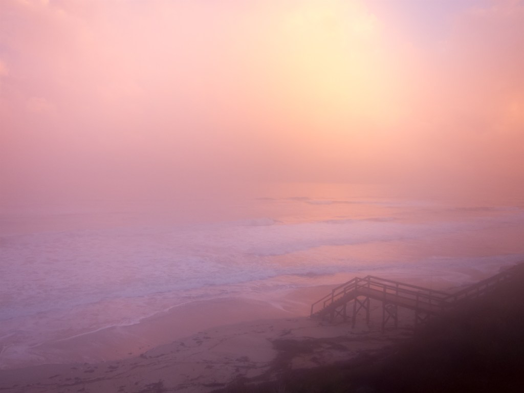
This is the original at the shore image. The final image follows.

At the Shore
This is all about abstraction, presenting the shapes and colors without the distracting detail of the sand pebbles and the small lines of waves. It fits how I see, feel the scene when I am lying in the sun on a beach squinting at the ocean. That little bit of magenta in the mid ground which is easy to ignore or miss in the original becomes more prominent.
There are myriad darkroom techniques to achieve these effects. I have used what amounts to a digital darkroom to transform certain images into something more than an accurate record of a scene, something that allows me to use my imagination and, I hope, engage yours.

You must be logged in to post a comment.